Building and Scaling the JPMorgan Spectrum Design System in Figma
JPMorgan Asset Management’s Spectrum is a powerful, proprietary, data-driven investment platform containing over 120 applications and used by over 4,000 users to manage $3 trillion in client assets.
Design System Lead
2 Years
Developers, Product Owners, Senior Stakeholders
JPMorgan Asset Management
Project Summary
JPMorgan Asset Management's Spectrum is a powerful, proprietary, data-driven investment platform containing over 120 applications and used by over 4,000 users to manage $3 trillion in client assets.
I joined JPMorgan Asset Management in November 2021 as a User Experience designer to build the Spectrum Design System (SDS) Figma Component Library. The Spectrum Design System Figma Component Library was created to unify the design process across JPMorgan Chase Asset Management, addressing the challenges of inconsistency and inefficiency faced by designers.
By developing a scalable and flexible system that supports over 120 internal applications globally, the library has enabled a cohesive user experience, streamlined development processes, and significantly improved designer productivity.
Problem
At the time I joined there was a Spectrum Design System (SDS) codebase but no Figma component library meaning that instead of having a standardised approach for building designs and a library of reusable elements, designers faced the challenge of recreating commonly used design elements for each new Spectrum app design.
This process was not only time-consuming but also introduced the risk of inconsistency, as the design elements, created independently, led to a fragmented look and feel across Spectrum applications.
When the SDS team set out to create the Spectrum Design System Figma Component Library, the goal was to unify the look and feel across hundreds of internal applications used globally. This initiative aimed to enhance consistency, streamline development processes, and improve the user experience for both designers and users
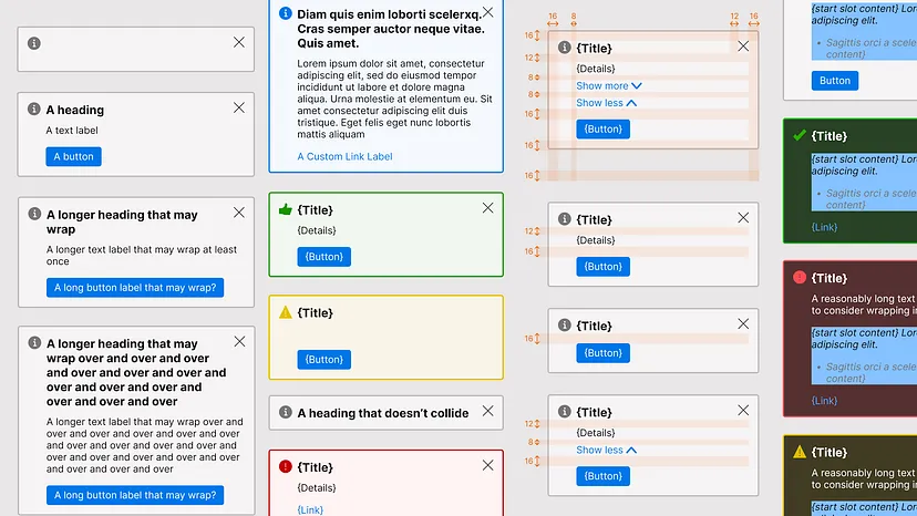
The actual SDS components cannot be posted publicly. This image is from EightShapes and resembles the design of the SDS alert component. Originally published by Nathan Curtis in his article "Component Visual Test Cases,"
Stakeholder Buy-In
Due to all the issues listed above, the plan was to start from scratch and create a new Component Library in Figma. I wanted it to be a pixel-perfect match to what we have in production (the SDS Codebase). This would require a lot of time and effort which meant that we needed investment from senior management.
My product owner and I created a sample of what a couple of Figma Component Library components could look like to present to a Managing Director, a key figure in Asset Management. The meeting would determine if the Spectrum Design System Figma Component Library was worth investing in as an initiative from a business perspective.
By demonstrating how the components would work in Figma and how it would free up designers’ time by letting them focus on actual user experience issues instead of spending time tweaking UI elements we successfully persuaded the key Managing Director to invest in the Figma Component Library
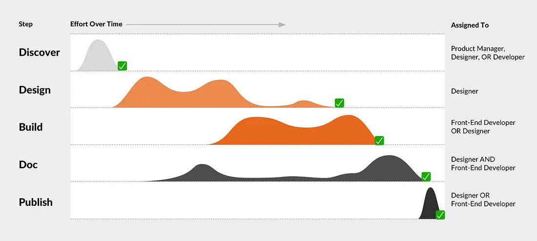
This graph shows the varying effort levels across different stages of our design system implementation, from stakeholder buy-in to process refinement. It highlights how our team's focus shifted between discovery, design, development, and documentation as we progressed. Originally published by Nathan Curtis in his article "Design System Features, Step-by-Step,"
Process
Since I was relatively new to the company, I wanted to make sure that I get a clear understanding of all the components. I worked closely with engineers and product owners to understand all the properties and limitations. The SDS team and I also planned out sessions with multiple other design system teams across JPMorgan Chase to get an understanding of how they approached the design system.
Through research into the needs of our future users, the rest of the Spectrum UX design team, we discovered that a robust library capable of supporting every app was essential. I built the system from the ground up, ensuring that complex components were constructed using simpler components and styles as their foundation.
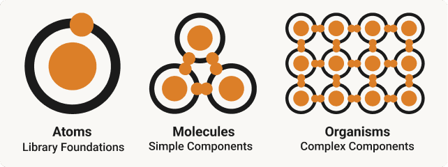
We also ran competitor analysis with both internal and external design system component libraries to learn what the industry standard is. We found out that a good design system Figma component library follows the Atomic Design Methodology and starts with solid foundations:
1 - Laying the Foundations (Atoms)
2 - Building the components (Molecules)
3 - Tying it all together (Organisms)
Component Architecture
Before making the Figma Component Library, Spectrum designers were already familiar with Figma, but didn’t leverage the advanced design system features that could streamline their workflows.
Through speaking to the design team I found that a lot of times even small features that they had to design in Figma were time consuming. A designer could spend hours or days even on simple UI design or prototype in Figma.
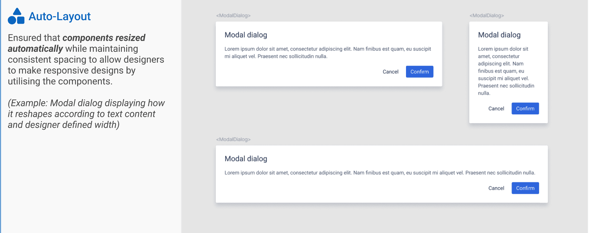
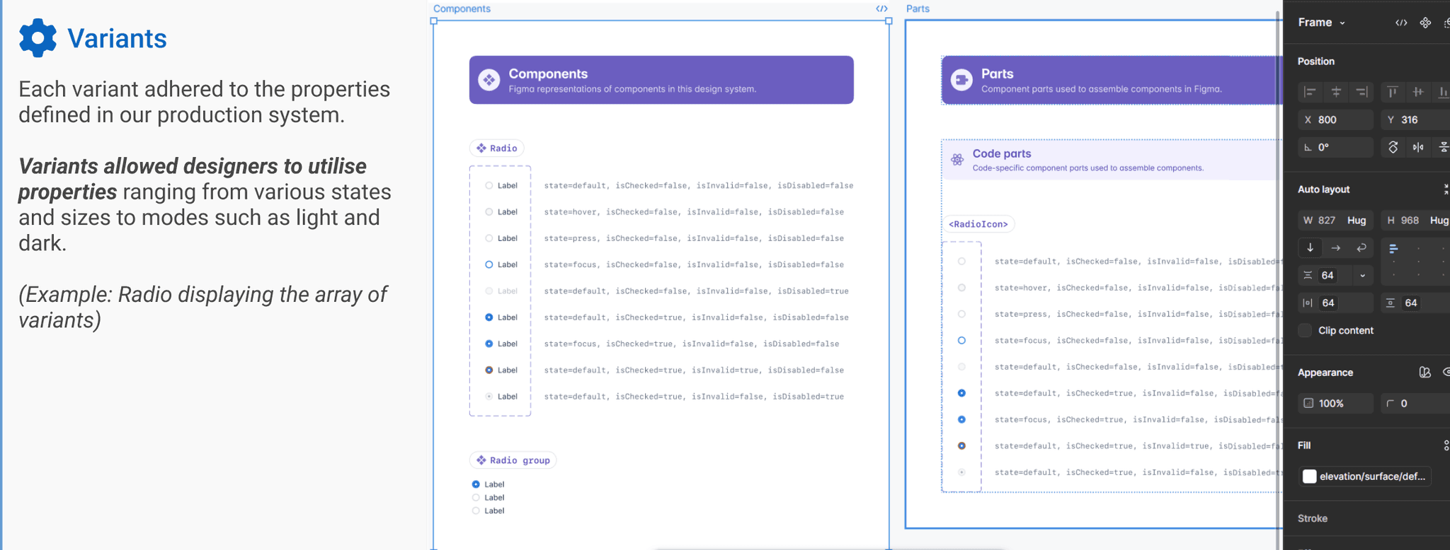
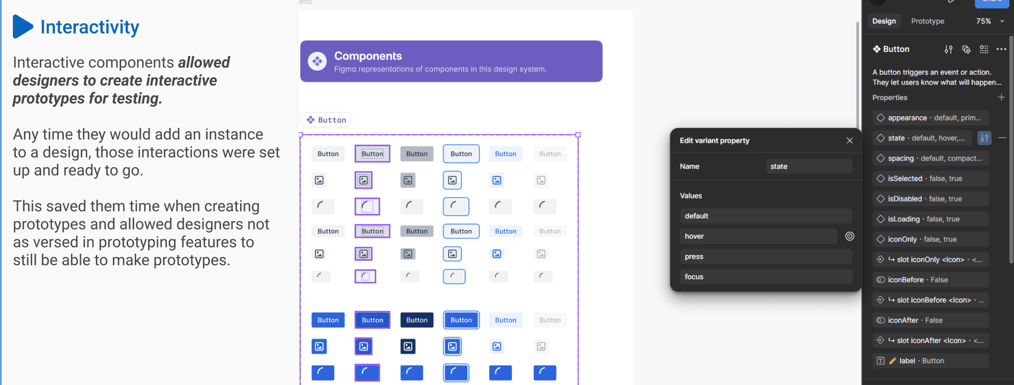
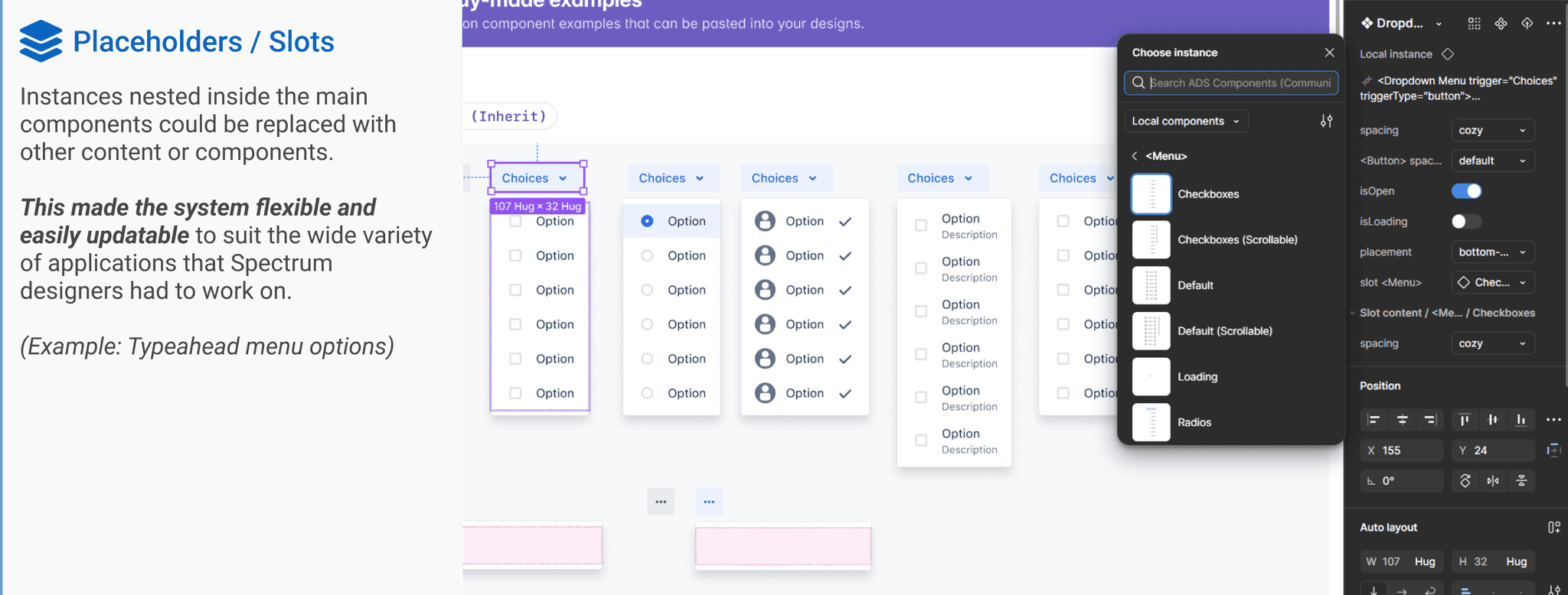
To address this issue, I incorporated the following Figma features into each of the 36 components in the library, enabling the team to build products more efficiently and effectively:
(The actual SDS components cannot be posted publicly. These images use Atlassian Design System components, which closely resemble the design and functionality of the SDS components.)
Collaboration and Continuous Improvement
Building the Spectrum Design System was a collaborative effort that involved regular feedback from the entire design team. This iterative approach ensured that the system was continuously improved and remained relevant to their needs.
I would frequently use time reserved for design review to present updates to the system and hold Q&A sessions. I worked with my product owner to send designers surveys on a regular basis to collect feedback on the components. I frequently updated and added new variants based on designer requests.
I found Figma comments to be the most useful medium for communication as it provided designers an asynchronous way to send me feedback about the library in-context. This was especially useful for designers based in other time zones.
Maintaining an open line of communication and gathering feedback allowed me to continually improve the system to enhance the user experience for designers and by extension Spectrum end-users.
Evolution of the Governance Model
Solitary Beginnings
🧑💻Initially, the Spectrum Design System was managed by a single Designer, me, focusing on creating and maintaining the Figma Library
⚡This solitary model allowed for quick decision-making but was limited by the capacity and perspective of one individual.
This was taken from the EightShapes article "Team Models for Scaling a Design System,". Evolving Past Overlords to Centralize or Federate Design Decision-Making Across Platforms.
Transition to Centralised
🚀As the system gained traction, we expanded to a centralised model by hiring two
additional designers dedicated to the Library.
✒️This core team focused on creating and maintaining components, ensuring consistency and alignment across the design system.
This was taken from the EightShapes article "Team Models for Scaling a Design System,".
Embracing a Federated Approach
🫂Currently, we are transitioning to a federated model to include broader team contributions.
🎓Design Pod leads are being included into the process, with plans to expand involvement to the entire design team.
🤝This approach aims to leverage diverse insights, enhance component relevance, and foster a sense of ownership across the team.
This was taken from the EightShapes article "Team Models for Scaling a Design System,".
Conclusion and outcome
The Spectrum Design System Figma Component Library has successfully streamlined and unified the design process at JPMorgan Chase Asset Management. By documenting and structuring components in Figma, we created a scalable, flexible, and efficient system that supports over 100 internal applications globally. This project has enabled us to build more consistently and effectively, ensuring a cohesive user experience across all Spectrum applications.
The adoption of the SDS Figma Component Library by the global JPMorgan Asset Management Spectrum Design team stands as a testament to its success. The metrics speak for themselves, with monthly inserts for components averaging 50k, demonstrating the library's extensive utilization and value. Designers have expressed immense satisfaction with the system, noting significant time savings and improved workflow. Developers also benefit from the well-documented and easily inspectable files, making the hand-off process smoother and more efficient.
While there is always room for improvement, the positive feedback from product teams highlights the real benefits and the solid foundation we have built. The Spectrum Design System has enhanced design consistency and efficiency, making collaboration between designers and developers more effective. Moving forward, we anticipate that this system will continue to support and scale with our evolving needs, helping us maintain a high standard of user experience.


